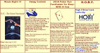
 I'm not sure if I'm shocked, thrilled or in awe about the Jacksonsville, Maryland Optimist Club website.
It is packed full of information about their club projects,where they meet and how to join. Plus it has dozens upon dozens of back pages opening up to more information about the zone, district and Optimist International than one can digest in one viewing.
Imagine this, the landing page is three home pages in one or more specifically, 12 pages when printed on legal size paper. Wow!
 Kudos to the club and their very passionate webmaster who has taken on the task of promoting the club's activities and preserving their history. With a couple additions, you can make your site even more enjoyable. Please consider these suggestions:
Navigation is a good thing. There is nothing wrong with giving your readers some directions as to how to best get around your site and find the information they need. Very simple tabs for Home, About Us, Projects, Membership, Optimist International, and District would make it so much easier to find information and much less overwhelming.
Bullet points rock. Pictures and stories are interesting, but online people are busy people. They want fast, concise information and often less is more.
It is good to have choices for your prospective new members; however information overload can cause indecision if it is difficult to figure where one might fit in or how they can make a difference. Make it easy for others to participate by helping them sort through the information you provide in a timely manner. Make it easy for everyone to say, "Yes, I want to be involved."
The pictures represent approximately one third of the Jacksonville Optimist Club home page.

